
Most IT leaders assume that a green status indicator means everything is fine. That assumption is one of the most common and costly mistakes in network operations. The role of dashboards in network management goes well beyond displaying color-coded health summaries. Dashboards are curated decision-support interfaces, built on computed metrics and configured thresholds, not unfiltered views of infrastructure reality. For MSPs managing dozens of client environments and enterprises operating across multiple sites, understanding exactly what a dashboard does and does not show you is the difference between proactive operations and reactive firefighting.
Table of Contents
- Understanding dashboards as decision-support tools
- Common pitfalls: why dashboards can mislead network managers
- Designing dashboards to drive actionable network decisions
- Case studies: dashboard implementations from leading network platforms
- Applying dashboards for MSP and multi-location network success
- A closer look: why most dashboards fail MSPs and how to fix them
- Empower your network management with Netverge dashboards and AI
- Frequently asked questions
Key Takeaways
| Point | Details |
|---|---|
| Dashboards simplify network data | They provide a curated, actionable view of network health rather than raw telemetry. |
| Beware of dashboard certainty | Visual summaries can conceal early issues, so don't rely solely on dashboards for diagnosis. |
| Design for decision-making | Tailor dashboards by role, include drill-downs, and focus on metrics that drive action. |
| Segment dashboards by function | Use multiple dashboards for SLAs, performance, and reliability to improve clarity and response. |
| Leverage AI and automation | AI-powered insights and workflow automation enhance monitoring effectiveness and reduce toil. |
Understanding dashboards as decision-support tools
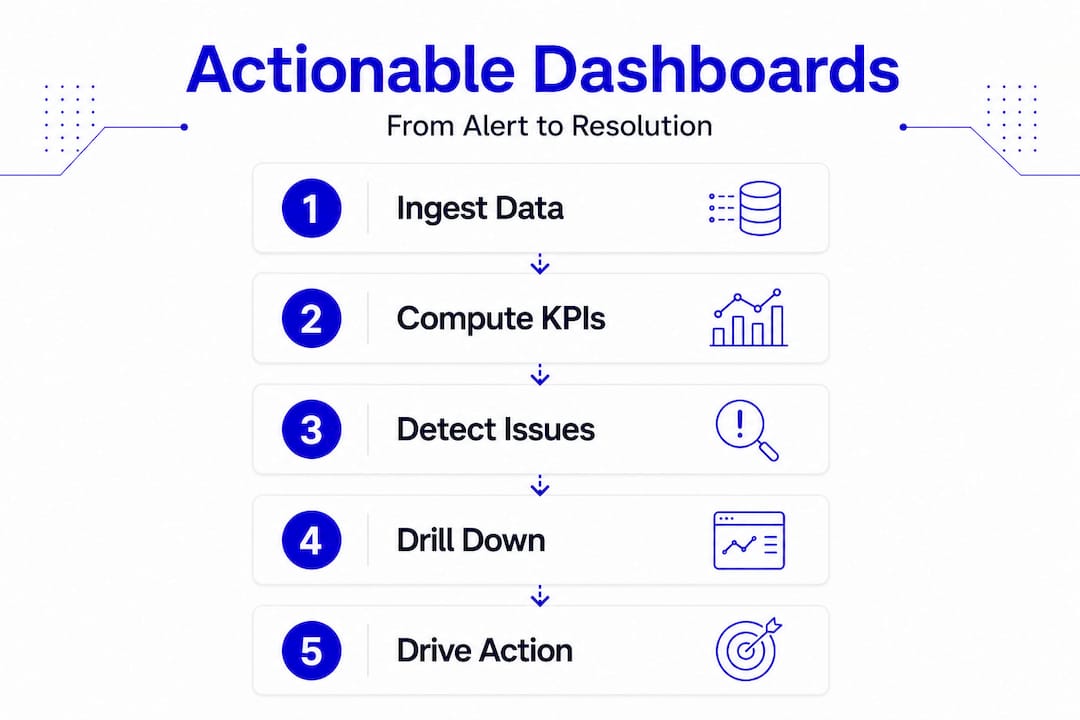
Dashboards are not raw telemetry feeds. They are observability and reporting layers that ingest telemetry, compute KPIs and SLIs, and present a curated state for human or automated action. That distinction matters enormously in practice.
Think about what that means for your team. An operator sees device availability and alert counts. An engineer drills into latency distribution and packet loss trends. An executive views SLA compliance percentages by region. The same underlying telemetry powers all three views, but each dashboard is a filtered lens, not a complete picture.
The key functions of network dashboards reflect this layered design. When built well, they serve these core purposes:
- Aggregation: Pull metrics from multiple network devices, services, and monitoring agents into a single interface
- Computation: Convert raw telemetry into meaningful KPIs such as availability percentage, mean latency, or error rate
- Role-based presentation: Surface the right metrics for the right audience, reducing noise and cognitive load
- Alerting integration: Highlight when metrics cross defined thresholds, triggering human or automated responses
- Drill-down access: Link from summary visuals to detailed source data, logs, and runbooks for faster troubleshooting
That last point is often underbuilt. A dashboard that shows a problem but offers no path to investigate it is a dead end. Effective network monitoring dashboards always connect the summary layer to the source layer. Without that connection, your team spends time hunting for data instead of resolving incidents.
Common pitfalls: why dashboards can mislead network managers
Here is what most dashboard guides skip over. The very features that make dashboards readable, averaging, aggregation, and color coding, are also the features that hide problems.
"Dashboards summarize. They do not explain. They emphasize what is easy to collect, which is why defaults, templates, and prebuilt metrics often become the unofficial definition of network health." Source
Consider a simple example. A five-minute average latency metric looks stable at 18ms. What that metric may not show is a 200ms spike that lasted 30 seconds and impacted real-time voice traffic. The averaging compresses that spike into a number that looks normal. Your dashboard shows green. A call quality complaint arrives three hours later, and your team has no visibility into what caused it.
This is what researchers call "dashboard certainty": a state where the dashboard is technically accurate but operationally misleading because it only reflects what was selected for measurement. It creates false confidence, especially when teams treat default templates as authoritative without reviewing whether those templates capture the signals that matter to their specific environments.

The risks compound across distributed networks. When you manage 50 locations, a single misconfigured threshold or missing metric at one site can go unnoticed while everything else looks healthy. You need to understand what your monitoring strategies are actually measuring, not just what they are displaying.
Pro Tip: Always validate dashboard metrics against operational realities. When an incident occurs, trace it back to the dashboard state at the time of impact. If the dashboard showed green while a problem was forming, that is a signal to revisit your thresholds, sampling intervals, and metric selection.
Designing dashboards to drive actionable network decisions
Knowing what dashboards get wrong makes it possible to design them correctly. The goal is not more charts. The goal is dashboards where every widget supports a specific operational decision.
For MSPs and multi-location enterprises, dashboard design should be audience and decision-cadence specific: separate executive views from engineering views, and make sure each dashboard answers a concrete operational question rather than just reporting a snapshot.
Here is a practical design sequence:
- Define your dashboard contracts. Create separate dashboards for SLA monitoring, performance analysis, reliability and error budgets, and security posture. Each has a different audience and a different decision cadence.
- Set and review thresholds consistently. Across all sites, apply uniform threshold logic so that a deviation at one location is treated the same way as a deviation at another. Inconsistent thresholds create inconsistent alerts.
- Build in drill-down paths. Every summary widget should link to the underlying data source, relevant log view, or runbook. If an engineer cannot move from a dashboard alert to an investigation in under two clicks, the dashboard is slowing them down.
- Assign role-based access. Executives need SLA compliance and business impact metrics. Engineers need packet-level detail and trend data. Support staff need ticket linkage and device status.
- Audit your charts quarterly. Remove any widget that does not drive a documented decision or action. Dead metrics erode trust in the dashboard over time.
The table below shows how different dashboard types serve different operational needs:
| Dashboard type | Primary audience | Key metrics | Decision it drives |
|---|---|---|---|
| SLA monitoring | Executives, account managers | Uptime %, SLA compliance | Contract performance, escalation triggers |
| Performance analysis | Network engineers | Latency, throughput, packet loss | Capacity planning, congestion response |
| Reliability and error budget | Site reliability engineers | Error rate, change failure rate | Release decisions, risk tolerance |
| Security posture | Security operations | Policy violations, anomaly counts | Incident response, compliance reporting |
Arista's CloudVision, for example, computes SLA health by location using configured thresholds applied uniformly across sites, presenting performance in percentage terms that flag underperforming KPIs. That design reflects exactly this principle: consistent thresholds, location-level visibility, and KPI-focused presentation.
The real-time monitoring guide from Netverge expands on how to build threshold strategies that scale across distributed environments without generating excessive alert noise.
Pro Tip: Design every chart to answer one question. Write that question in the chart title. If you cannot, the chart probably does not belong on the dashboard.
Case studies: dashboard implementations from leading network platforms
Real-world implementations illustrate how the design principles above translate into operational tools. Two platforms offer instructive examples.
VMware NSX Manager provides multiple monitoring dashboards accessible from a centralized UI. NSX Manager dashboards cover system health, networking, security, and compliance, each with interactive elements and click-through navigation to source pages. That click-through design is the critical feature: when an engineer sees a security alert, they can navigate directly to the relevant data without switching tools.
Arista CloudVision takes a location-first approach. CloudVision's SLA dashboards surface underperforming KPIs at the site level, using overlay dashboards to provide deeper detail on specific indicators. The platform separates connectivity, performance, application, and infrastructure views, giving different roles the focus they need without forcing everyone through the same interface.
| Feature | NSX Manager | CloudVision CUE |
|---|---|---|
| Dashboard scope | System, network, security, compliance | Connectivity, performance, applications, infrastructure |
| Drill-down support | Click-through to source pages | Overlay dashboards for KPI detail |
| Role focus | Security and infrastructure teams | Network operations, MSP environments |
| SLA handling | Compliance dashboards | Percentage-based SLA thresholds by location |
| Interaction model | Interactive UI navigation | Location-level aggregation with KPI overlays |
For enterprise network monitoring at scale, both platforms demonstrate that dashboard effectiveness comes from intentional design, not from showing more data.
Applying dashboards for MSP and multi-location network success
Translating dashboard design principles into day-to-day operations requires process discipline. Dashboards that are not integrated into workflows become decoration.
Dashboards that do not drive response risk becoming misleading abstractions over time. The fix is embedding dashboards into the operational cadence: daily standups, incident reviews, capacity planning sessions, and postmortems.
Well-structured dashboards also reduce mean time to detect and resolve by surfacing alerts, linking to runbooks, and enabling incident snapshots that feed directly into postmortem documentation. That operational loop is where dashboards generate measurable value.
Recommended practices for MSPs and multi-location enterprises:
- Segment dashboards by audience: high-level KPIs for executives, granular metrics for engineers
- Review and update thresholds quarterly to reflect changes in traffic patterns and service baselines
- Use dashboards as the entry point to investigation, not the conclusion
- Automate alerts and remediation workflows triggered by dashboard threshold breaches
- Train teams to treat dashboards as guides, not ground truth, and to question stable-looking metrics during incident reviews
- Incorporate dashboard snapshots into postmortems to build a factual timeline of network state before and during incidents
- Establish feedback loops from incidents back to dashboard design, adding or refining metrics based on what was missed
Automated network diagnostics can extend this workflow further by triggering investigation and remediation steps automatically when dashboard alerts fire, reducing reliance on manual intervention.
A closer look: why most dashboards fail MSPs and how to fix them
Here is the uncomfortable reality: most MSPs and enterprise IT teams are running dashboards that were configured once, never revisited, and are now quietly misrepresenting their network health. The green lights are on. The alerts are silent. And somewhere, a problem is forming that the dashboard cannot see.
The root cause is not the dashboard tool. It is the assumption that deploying a dashboard is the same as achieving visibility. It is not. Dashboard certainty causes teams to delay intervention precisely because the interface looks confident and calm.
The fix requires three things that most teams avoid because they take ongoing effort.
First, split your strategic dashboard functions into separate contracts. SLA monitoring, performance analysis, and reliability tracking are three different operational concerns. Collapsing them into one view produces a summary that serves no one well.
Second, tie automation to your dashboards. When a threshold fires, something should happen automatically: a ticket opens, a diagnostic runs, an engineer gets paged. Dashboards that alert into silence teach teams to ignore alerts.
Third, build a culture of critical reading. Engineers should be trained to ask, "What could this dashboard be missing?" at every incident review. That question is not a sign of distrust in the tooling. It is the discipline that separates teams that detect problems early from teams that only find them after users complain.
"You cannot remediate what you cannot see." That statement defines the importance of dashboards in IT management. But visibility is only real when your dashboards are measuring the right things, at the right granularity, for the right audience.
Empower your network management with Netverge dashboards and AI
Understanding the pitfalls and best practices outlined above is one thing. Having the tools to act on them is another. Netverge was built specifically to give MSPs and multi-location enterprises the kind of dashboard infrastructure that actually supports operations, not just reporting.
Netverge's AI-powered network monitoring platform delivers real-time visualization tailored to distributed environments, correlating events across sites to reduce alert fatigue and surface root causes faster. The no-code workflow builder lets you connect dashboard threshold alerts directly to automated incident response sequences, no scripting required. Integrated AI-powered ticketing closes the loop between dashboard alerts and resolution workflows, giving your team a single interface from detection to closure. If your current dashboards are showing green while problems are forming, it is time to see what real visibility looks like.
Frequently asked questions
What exactly does a network management dashboard display?
A network management dashboard shows curated metrics including network health, device status, performance indicators, alerts, and compliance data, consolidating data from multiple sources to support monitoring and real-time decision-making across your infrastructure.
Why can dashboards sometimes give a misleading impression of network health?
Because they rely on averaging and compression, dashboards can conceal short-lived anomalies and early degradation signals, creating misplaced confidence when teams interpret a stable display as a definitive indicator of health.
How should dashboards be designed to help MSPs manage multiple locations?
Dashboards should separate executive SLA views from engineering detail views, apply consistent thresholds across all sites, and include drill-down paths to source data so engineers can investigate issues at any location without switching tools.
What is the benefit of including drill-down capabilities in dashboards?
Drill-down links let engineers move from a summary alert to detailed source data and runbooks in seconds, reducing the time spent hunting for context during active incidents and improving mean time to resolution.
How do AI-powered dashboards improve network management?
AI-powered dashboards combine data collection, analysis, alerting, and reporting into one platform, correlating events across multiple sources to reduce noise, identify patterns, and give IT teams predictive insights that help prevent issues before users are impacted.