
Network dashboards are among the most relied-upon tools in enterprise IT operations, yet they are also among the most misunderstood. Many IT managers treat a wall of green status indicators as confirmation that everything is running smoothly. But as research consistently shows, dashboards can present a misleading picture when they rely on sampled data, shallow thresholds, or incomplete signal coverage. This guide breaks down what a network dashboard actually is, how it shapes decisions, where it falls short, and how to build one that gives you genuine operational confidence.
Table of Contents
- Defining the network dashboard: Beyond the basics
- How network dashboards shape decision-making
- Common pitfalls and misconceptions with network dashboards
- Building and optimizing dashboards for actionable visibility
- Why trusting dashboards blindly is the biggest risk IT leaders face
- Take the next step: Modern network dashboards and observability
- Frequently asked questions
Key Takeaways
| Point | Details |
|---|---|
| Dashboards are summaries | A network dashboard provides a curated overview of network health, not a complete diagnosis. |
| Decision alignment matters | A dashboard's true value comes from supporting the right IT decisions, not just displaying data. |
| Hidden dangers exist | Aggregation and poor visibility can mask issues, so never trust surface-level 'green.' |
| Data quality drives insight | High-resolution, comprehensive telemetry is essential for accurate, actionable dashboards. |
| Continuous review is key | Regularly validate and update dashboards to ensure reliable, decision-ready visibility. |
Defining the network dashboard: Beyond the basics
A network dashboard is a visual interface that consolidates key network metrics into a single, readable view. It pulls data from routers, switches, firewalls, endpoints, and other infrastructure components to display status, performance, and alerts in near real-time. The goal is to give operators a fast, top-level read on network health without requiring them to dig through raw logs or run manual queries.
But here is the critical distinction: a dashboard is a curated view, not a full diagnosis. It simplifies and aggregates, which is exactly what makes it useful at scale, and also what makes it potentially dangerous when treated as an authoritative source of truth.
Core elements in an advanced enterprise network dashboard include:
- Device health: Status of routers, switches, firewalls, and access points
- Uptime and availability metrics: Historical and real-time availability per device or segment
- Bandwidth usage and bottlenecks: Traffic volume, utilization rates, and congestion points
- Event and anomaly alerts: Triggered notifications based on predefined or AI-driven thresholds
- SLA compliance indicators: Real-time tracking of service level commitments
For enterprises managing dozens or hundreds of locations, achieving complete network visibility across all these dimensions is not optional. It is operationally essential.
Comparison: Basic vs. advanced network dashboards
| Feature | Basic dashboard | Advanced dashboard |
|---|---|---|
| Data refresh rate | Polling-based (5 to 15 min) | Real-time or near real-time |
| Device coverage | Core infrastructure only | Full topology including edge |
| Alert logic | Static thresholds | Dynamic, AI-driven anomaly detection |
| Drill-down capability | Limited or none | Full contextual drill-down |
| SLA tracking | Manual or absent | Automated with trend reporting |
| Integration | Siloed | Unified with ticketing and CMDB |
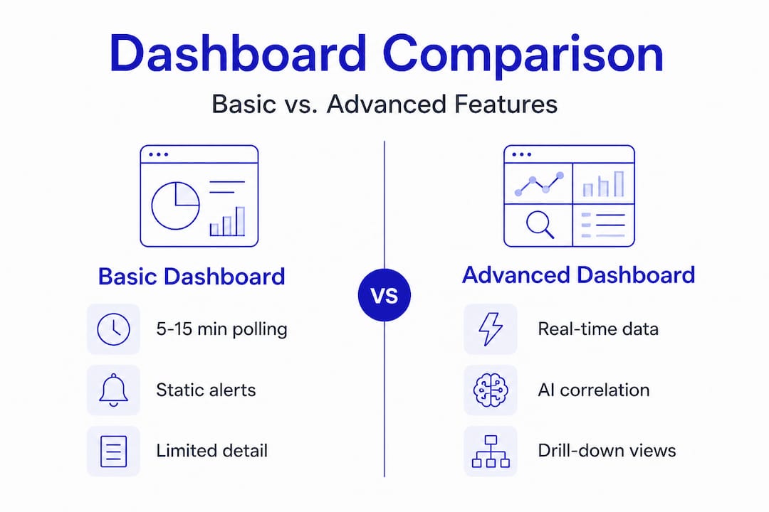
The gap between basic and advanced is significant. Modern monitoring platforms close this gap by integrating telemetry from every layer of the network, not just the most visible ones. When you are managing multi-location enterprise infrastructure, the difference between a 5-minute polling interval and real-time telemetry can mean the difference between catching a problem early and responding to an outage.

How network dashboards shape decision-making
A dashboard's true value is not in what it displays. It is in what decisions it enables. Dashboards are only as useful as their alignment with the specific operational choices your team needs to make. A dashboard built for executive reporting will fail your NOC engineers. A dashboard optimized for incident triage will not serve your capacity planning team.
Understanding this alignment is the foundation of effective dashboard strategy. There are three core decision domains every enterprise dashboard should support:
Incident triage and troubleshooting: Fast detection of anomalies, with enough context to begin root cause analysis without leaving the interface. AI-powered triage dramatically reduces mean time to identify (MTTI) by correlating signals across devices and locations automatically.
Strategic capacity planning: Long-term traffic trends, bandwidth utilization patterns, and growth forecasting data. This requires historical depth, not just real-time snapshots.
SLA adherence and stakeholder reporting: Structured views that track SLA monitoring essentials over time, exportable for executive or client reporting. These dashboards need to be accurate, consistent, and auditable.
A useful operational framework: decide which decisions each dashboard will support before you build it. Then work backward to determine what telemetry, refresh rates, and drill-down paths are required.
Pro Tip: Before deploying any dashboard, document the three to five specific decisions it will support. If a tile or widget does not map to one of those decisions, remove it. Clutter reduces response speed and increases cognitive load during incidents.
Actionability comparison: Simple vs. high-resolution telemetry
| Decision type | Simple/sampled telemetry | High-resolution telemetry |
|---|---|---|
| Incident detection | Delayed, often post-event | Real-time, proactive |
| Root cause analysis | Requires external tools | In-dashboard drill-down |
| Capacity planning | Rough estimates only | Accurate trend modeling |
| SLA reporting | Incomplete or inaccurate | Precise and auditable |
| Anomaly detection | Misses short-duration events | Captures transient spikes |
A well-structured event management workflow depends entirely on the quality of the data feeding the dashboard. High-resolution telemetry is not a luxury feature. It is the baseline requirement for dashboards that actually support decision-making under pressure.
According to best practices in the field, operationalizing a network dashboard means deciding what decisions it will support, ensuring high-resolution telemetry, and enabling drill-down without leaving the interface. That three-step framework is simple, but most enterprise dashboards fail at least one of those criteria.
Common pitfalls and misconceptions with network dashboards
This is where the real risk lives. Most IT teams know their dashboards are imperfect. Fewer understand exactly how those imperfections translate into operational blind spots.
The most dangerous assumption in network operations is that a green status indicator means everything is fine. It means everything that the dashboard is configured to measure is within the thresholds it is configured to check. Those are two very different things.
Common pitfalls to watch for:
- Over-reliance on summary status: A single green or red indicator aggregates dozens of underlying metrics. A device can appear healthy while experiencing packet loss, intermittent latency spikes, or interface errors that fall below alert thresholds.
- Undersampling and aggregation: Dashboards based on sampling can hide emerging instability. A 60-second spike in CPU utilization on a core router may never appear if your polling interval is 5 minutes.
- Shallow or generic thresholds: Default alert thresholds are built for average environments. Your environment is not average. A threshold set at 90% bandwidth utilization may be appropriate for a branch office and catastrophic for a data center uplink.
- Using log-centric tools for real-time decisions: Polling-based or log-centric approaches can lag significantly or become operationally expensive when you need topology-sensitive, time-critical visibility. These tools have their place, but they are not substitutes for purpose-built network monitoring.
"A dashboard can show green while underlying performance degradation exists because it only shows what you choose to measure."
This is not a hypothetical risk. It is a documented pattern in enterprise environments where dashboards were deployed quickly, never revisited, and gradually drifted out of alignment with the actual network topology and traffic patterns.
Specialized sensor data addresses this directly by expanding the signal coverage beyond what generic dashboards capture. When you have 24 specialized sensors covering everything from interface errors to application-layer performance, the gap between what the dashboard shows and what is actually happening on the network shrinks considerably.
For enterprise environments, monitoring best practices call for regular threshold audits, topology reviews, and data feed validation. These are not one-time setup tasks. They are ongoing operational disciplines.
Building and optimizing dashboards for actionable visibility
Awareness of the risks is only useful if it leads to action. Here is a structured approach to building dashboards that deliver genuine, reliable visibility rather than false confidence.
Map every dashboard tile to a specific operational outcome. Each widget should answer a specific question: Is this device available? Is this link saturated? Is this SLA at risk? If a tile cannot be tied to a specific decision or action, it is visual noise.
Validate data feed resolution and representativeness. Before trusting any dashboard, audit the underlying data sources. Confirm polling intervals, verify that all critical segments are covered, and check that aggregation logic is not masking short-duration events. Best practice is to ensure dashboards are fed with enough-resolution telemetry and include drill-down so operators can pinpoint and resolve root causes.
Ensure seamless drill-down capability. The path from "something looks wrong" to "here is the specific device, interface, and time window where the problem originated" should be navigable without leaving the platform. Context switching between tools during an incident adds minutes to resolution time and increases the chance of errors.
Schedule regular dashboard scope reviews. Networks change. New locations are added, traffic patterns shift, and critical applications change. A dashboard that was accurate six months ago may have significant blind spots today. Quarterly reviews are a minimum; monthly is better for rapidly growing environments.
Pro Tip: Involve your frontline NOC engineers in every dashboard design review. They are the ones using these tools under pressure, and they will identify blind spots that architects and managers miss entirely.
AI monitoring platforms simplify this process significantly by automating anomaly detection, dynamically adjusting alert thresholds, and surfacing context-rich alerts that point directly to root causes. For distributed enterprises, plug-and-play observability hardware like Vergepoints extends this intelligence to physical locations without requiring complex deployment or configuration.
The combination of high-resolution telemetry, AI-driven correlation, and seamless drill-down is what separates a dashboard that guides action from one that provides only surface-level reassurance.
Why trusting dashboards blindly is the biggest risk IT leaders face
Here is a perspective that rarely gets stated plainly in technical discussions: the most dangerous thing about a well-designed dashboard is that it looks authoritative.
A clean interface, smooth animations, and a wall of green indicators create a psychological effect. They signal order and control. And that signal can be accurate. But it can also be a representation of what the system was designed to measure, which may not be the same as what is actually happening on the network.
The IT leaders who manage the most reliable enterprise networks are not the ones who trust their dashboards the most. They are the ones who question them the most. They treat every status indicator as a starting point for investigation, not a final answer. They ask: what is this dashboard not showing me? What signals are not being captured? What thresholds were set two years ago and never revisited?
"A dashboard should never be the final word. Ask what might be missing."
This mindset, continuous validation and deliberate skepticism, is not about distrust of technology. It is about understanding the inherent limitations of any curated view. Dashboards are built by people who made choices about what to include and what to exclude. Those choices reflect priorities and assumptions that may no longer match your operational reality.
The practical implication is straightforward. Use dashboards as launchpads for investigation, not as conclusions. Build in regular reviews. Create a culture where operators are rewarded for surfacing what the dashboard missed, not just for responding to what it flagged. Explore network intelligence insights that go beyond surface metrics to give you the deeper context your dashboards cannot provide on their own.
Tool-centric complacency is a real risk in enterprise IT. The teams that avoid it are the ones that stay curious, stay skeptical, and treat their monitoring stack as something that requires continuous improvement, not periodic setup.
Take the next step: Modern network dashboards and observability
The gap between a dashboard that looks good and one that actually protects your network is real. Closing it requires high-resolution telemetry, AI-driven correlation, and tools designed specifically for the complexity of multi-location enterprise environments.
Netverge's intelligent network dashboards are built to address every limitation covered in this guide. From real-time anomaly detection to automated triage and contextual drill-down, the platform gives your team the visibility and confidence to act decisively. Deploy plug and play network visibility hardware at any location in minutes, and connect it directly to integrated incident management workflows that reduce response times and eliminate the tool-switching that slows resolution. Request a demo today and see what your current dashboard might be missing.
Frequently asked questions
What information should a network dashboard always include?
A network dashboard should always display real-time device health, traffic patterns, and critical alerts, with drill-down capability so operators can investigate anomalies without switching tools.
How can I avoid missing problems with my dashboard?
Ensure your dashboard uses high-resolution telemetry and covers all critical network segments, since sampling or aggregation can mask emerging instability before it becomes a visible outage.
Are AI-powered dashboards better than traditional ones?
AI-powered dashboards provide more proactive monitoring by dynamically adjusting thresholds and correlating signals across devices, detecting anomalies that static, threshold-based tools routinely miss.
Can network dashboards be customized for SLAs or compliance reporting?
Yes, dashboards should support custom views that track SLA adherence, stakeholder-specific performance metrics, and compliance requirements, with exportable reporting for audits and executive review.
What is the risk of relying only on dashboards?
Overreliance creates false confidence because dashboards may hide problems through curated metrics, aggregation, or shallow thresholds, leaving real instability invisible until it escalates into an incident.